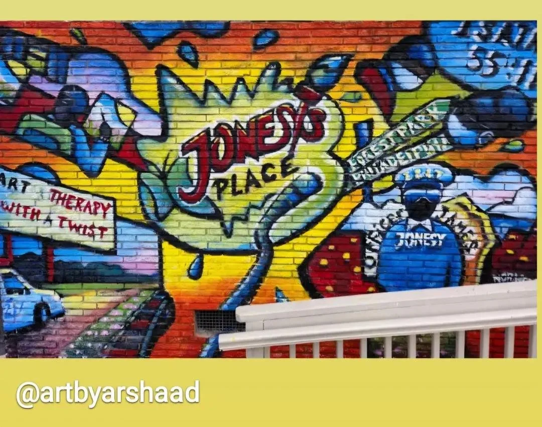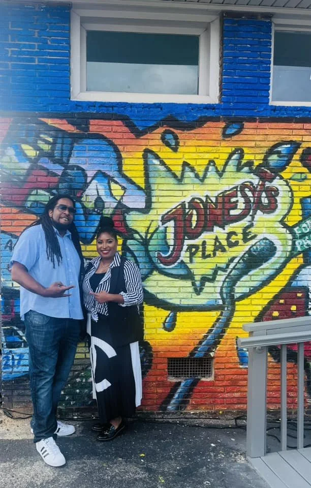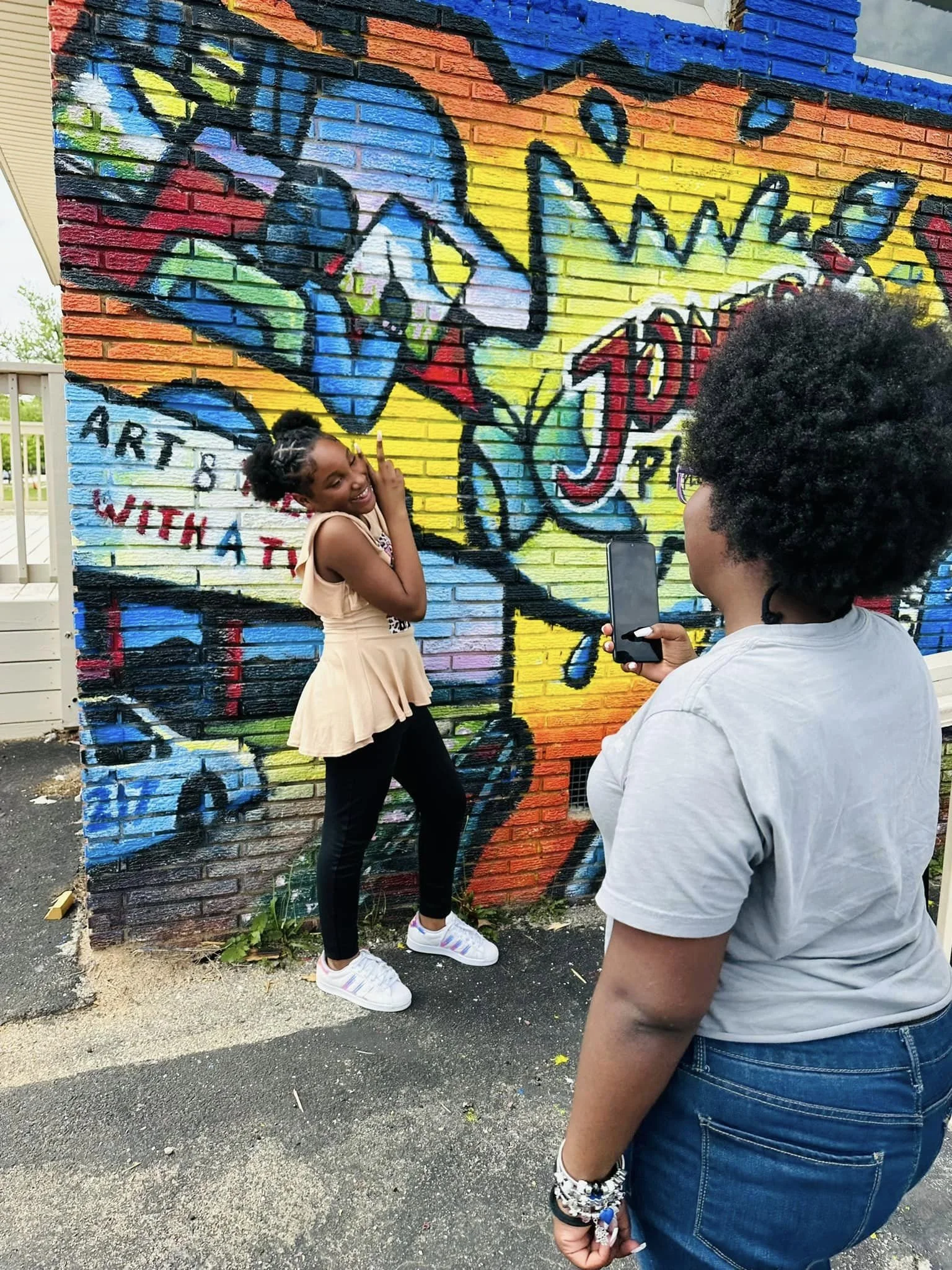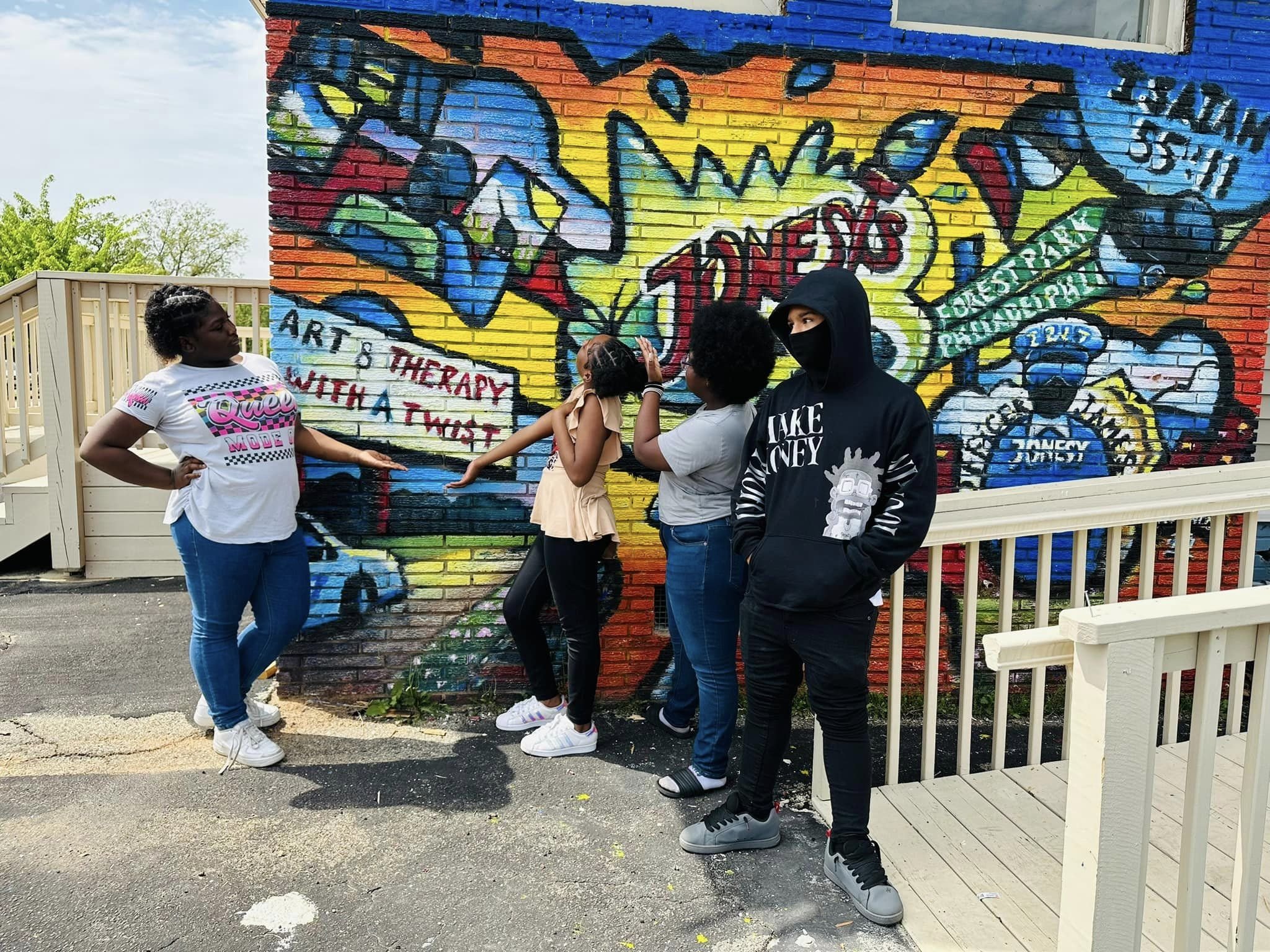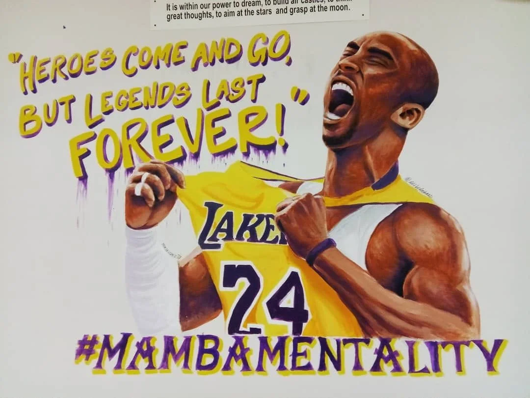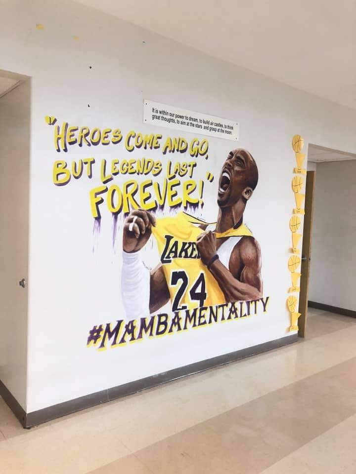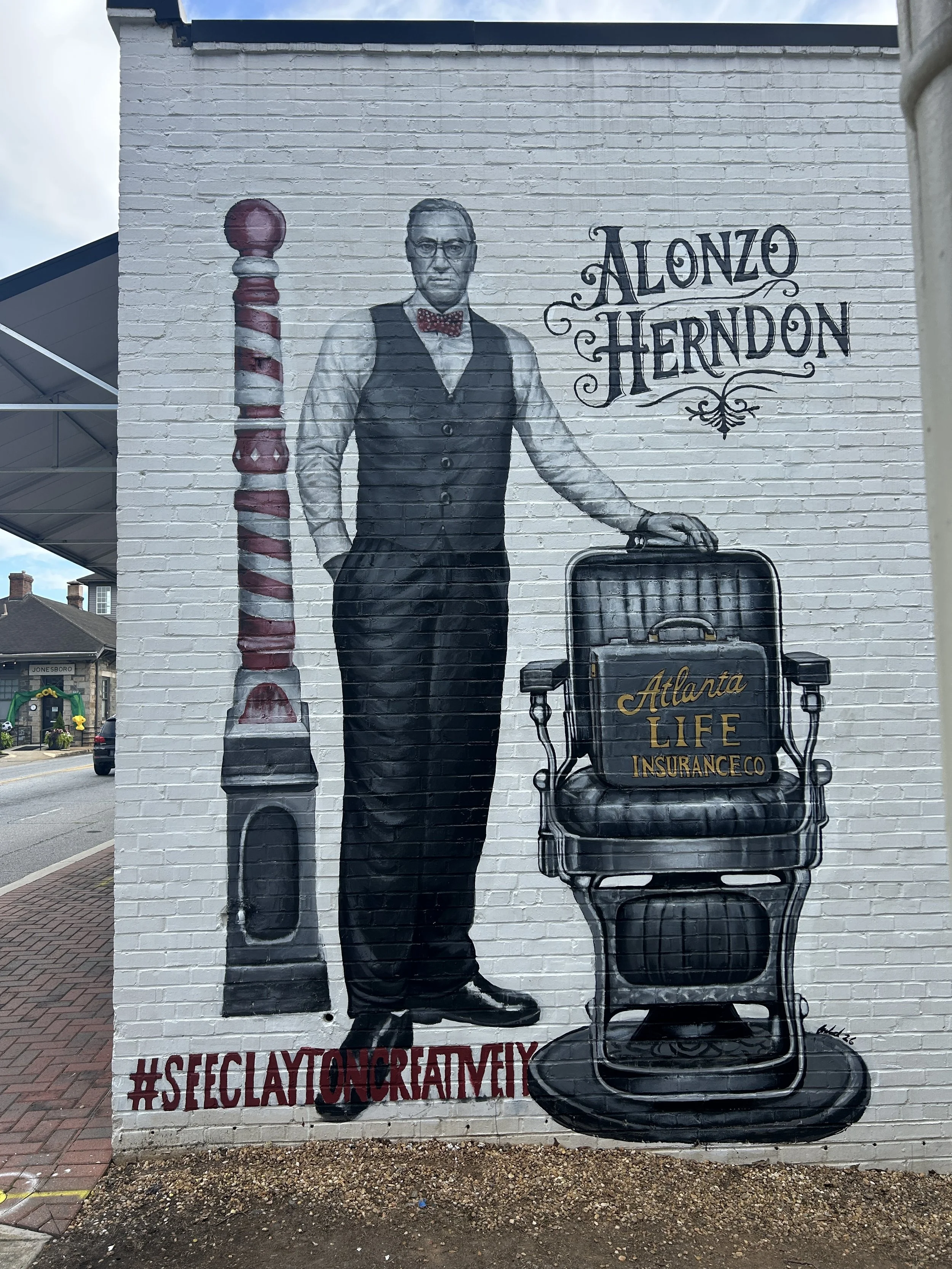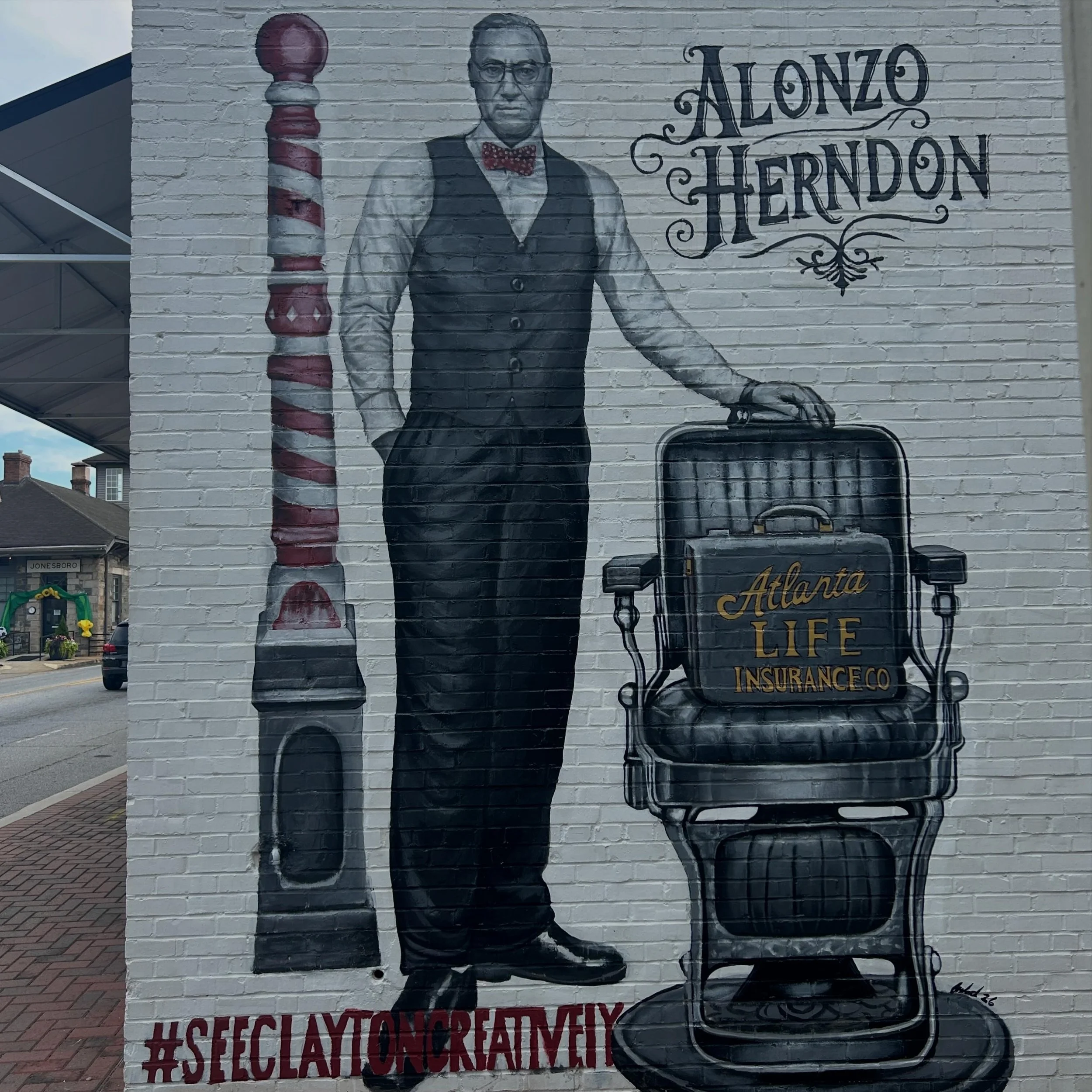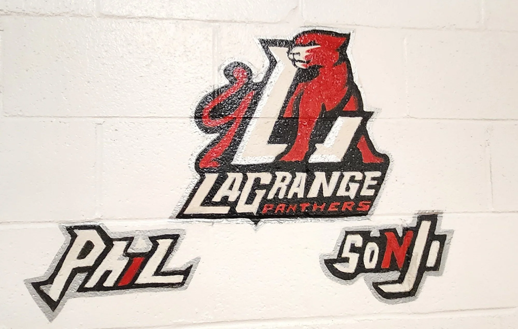

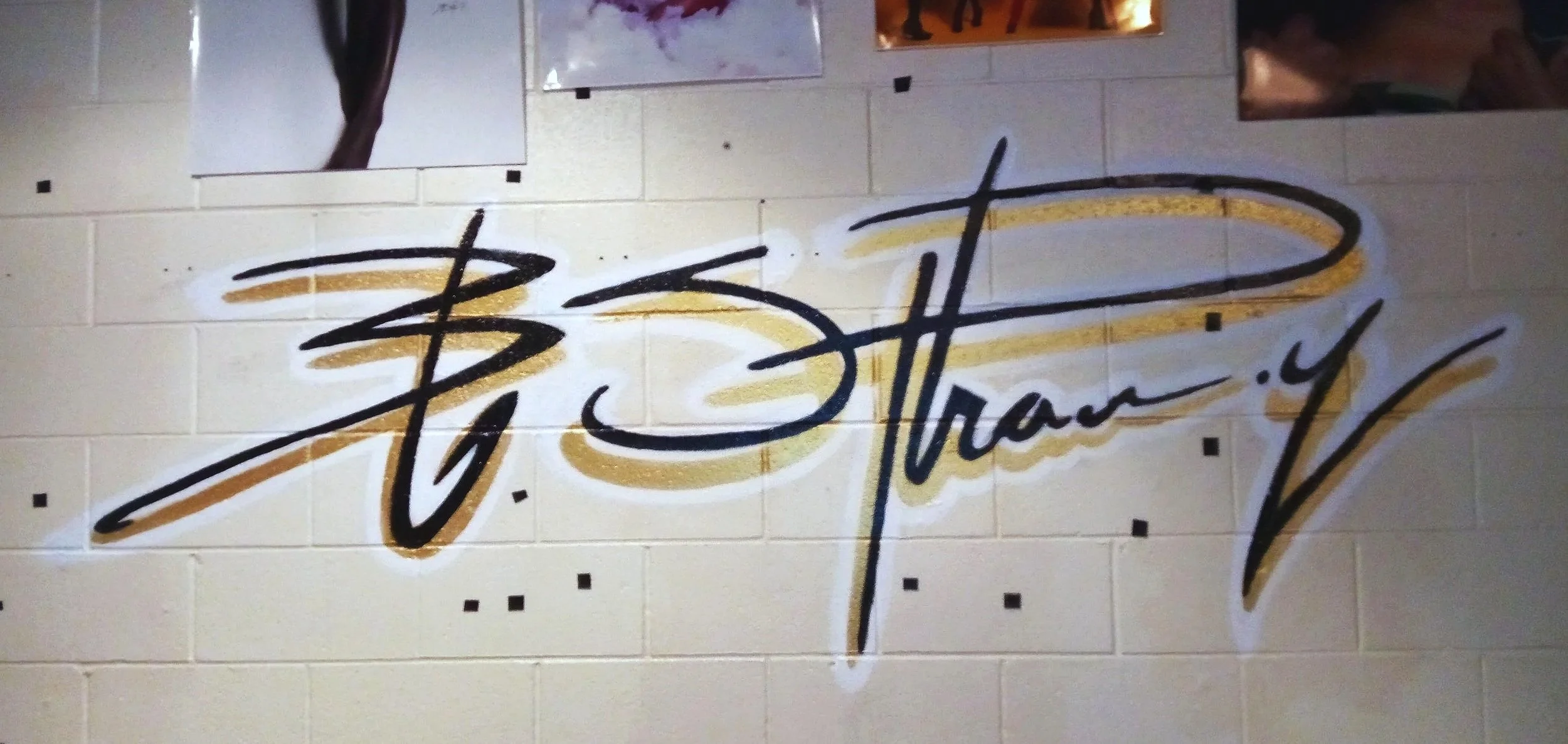
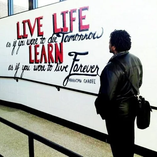
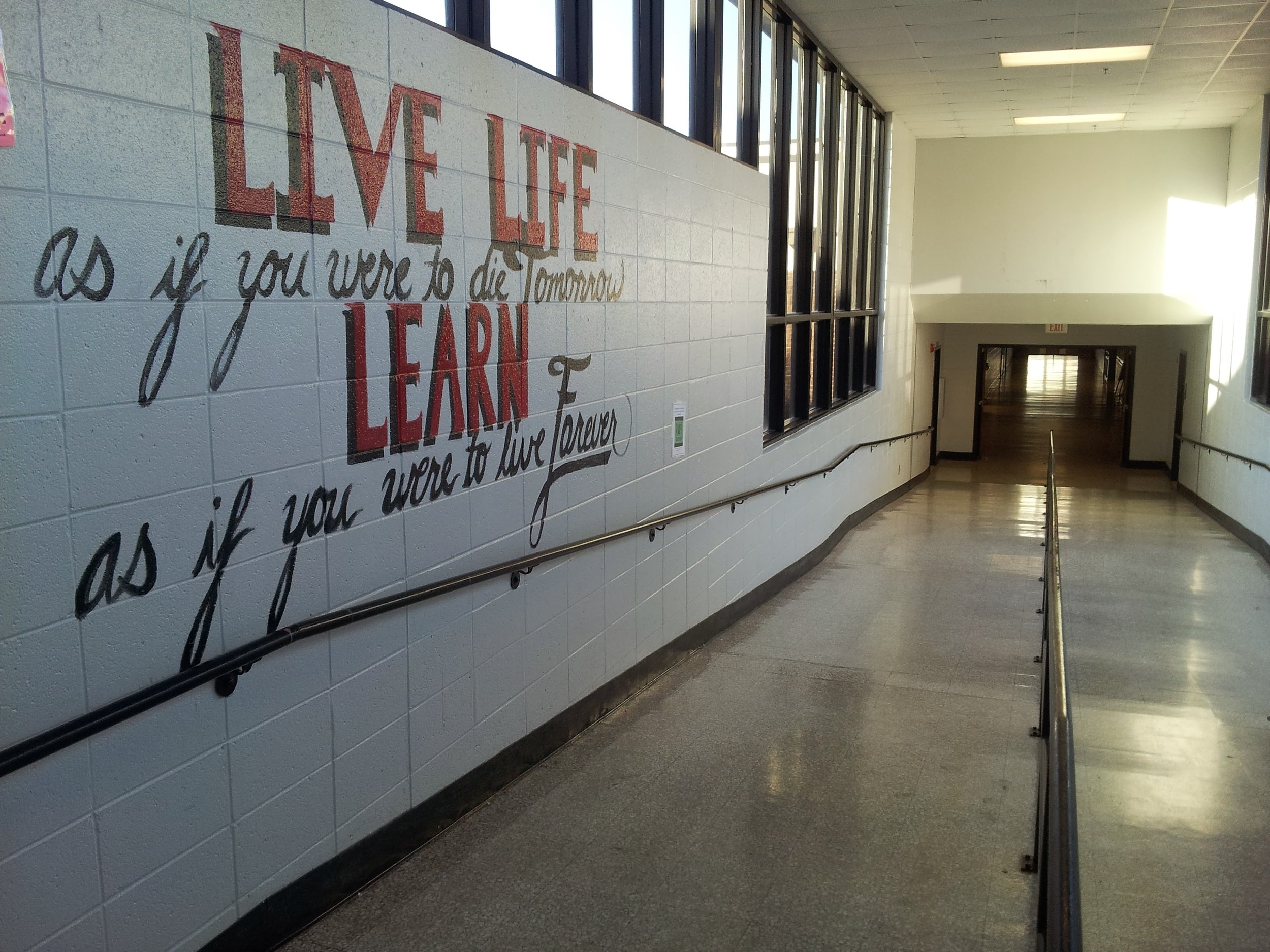

Word Art Mural establish a powerful visual anchor that communicates brand voice, values, or an evocative message—instantly legible, emotionally resonant, and highly shareable across photography and social channels.
Design approach
Hierarchy: One primary word or short phrase dominates (super-sized, heavy-weight type). Secondary words or fragments support the main message in smaller sizes, rotated or staggered to create flow.
Typeface strategy: Combine a custom geometric sans for the headline with tactile, hand-brushed scripts or condensed serif accents for personality and contrast.
Color & contrast: High-contrast palette for readability from distance (two to three dominant colors). Introduce an accent color for callouts or emphasis. Consider metallic or pearlescent pigments for selective letters to catch light.
Texture & finish: Use layered paint techniques—dry brush, scumble, and subtle glazing—so close viewing reveals brushwork and surface depth while maintaining crisp letter edges.
Composition & scale: Letters may overlap, extend beyond the mural edges, or break the grid to feel expansive. Negative space is intentional: allow breathing room so the type reads clearly at any vantage.
Interaction: Integrate photo-friendly zones (stable, well-lit areas) that encourage visitors to pose with specific words. Consider durable finishes and anti-graffiti coating for high-traffic sites.
Message & tone Bold. Concise. Optimistic. Choose language that reflects the site and audience: an inspirational verb (e.g., CREATE, RISE), a short mission phrase (e.g., DO GREAT THINGS), or a locality-driven declaration (e.g., ATLANTA MAKES). Keep copy punchy—3–6 words maximum for strongest impact.
Word Art Mural establish a powerful visual anchor that communicates brand voice, values, or an evocative message—instantly legible, emotionally resonant, and highly shareable across photography and social channels.
Design approach
Hierarchy: One primary word or short phrase dominates (super-sized, heavy-weight type). Secondary words or fragments support the main message in smaller sizes, rotated or staggered to create flow.
Typeface strategy: Combine a custom geometric sans for the headline with tactile, hand-brushed scripts or condensed serif accents for personality and contrast.
Color & contrast: High-contrast palette for readability from distance (two to three dominant colors). Introduce an accent color for callouts or emphasis. Consider metallic or pearlescent pigments for selective letters to catch light.
Texture & finish: Use layered paint techniques—dry brush, scumble, and subtle glazing—so close viewing reveals brushwork and surface depth while maintaining crisp letter edges.
Composition & scale: Letters may overlap, extend beyond the mural edges, or break the grid to feel expansive. Negative space is intentional: allow breathing room so the type reads clearly at any vantage.
Interaction: Integrate photo-friendly zones (stable, well-lit areas) that encourage visitors to pose with specific words. Consider durable finishes and anti-graffiti coating for high-traffic sites.
Message & tone Bold. Concise. Optimistic. Choose language that reflects the site and audience: an inspirational verb (e.g., CREATE, RISE), a short mission phrase (e.g., DO GREAT THINGS), or a locality-driven declaration (e.g., ATLANTA MAKES). Keep copy punchy—3–6 words maximum for strongest impact.